REIMAGINE BRAND EXPERIENCE ON PRIMARY WEBSITE
Determined how to position Freddie Mac's primary website, freddiemac.com, resulting in a clear story for their very distinct audiences.
GOAL
Freddie Mac wanted to present their story more clearly to distinct audiences (single-family property owners, multifamily property owners, company investors, media outlet, and the general population) on freddiemac.com.
Client
The Federal Home Loan Mortgage Corporation (FHLMC), known as Freddie Mac, is a public government-sponsored enterprise created in 1970 to expand the secondary market for mortgages in the US.
My Role
- Assisted preparation and facilitation of with discovery tasks
- Lead detailed experience audit and content analyses
- Participated in the creation of future state architecture options
- Lead wireframe creation to bring architecture options to life
- Assisted with planning and scoping of future project phases
My Deliverables
- 3 Discovery Workshops
- 5 Experience Audits
- 3 Content Analyses
- 2 Content Architectures
- 6 Interactive Wireframes
Discovery
Prepared and conducted two workshops with two colleagues and key about 20 Freddie Mac department representatives to understand their primary audience and current Freddie Mac content distribution.
Understand Audiences
Workshop #1 was a Proto-Persona activity completed with representatives from their 4 primary lines-of-business to help us learn about each audience type and their roles.
Content Assessment
We completed an analysis of over 9,000 pages across all Freddie Mac sites to have a thorough understanding of their current content distribution in preparation for workshop #2.
Define
Each member of our small team crafted two future architecture options independently. Then we selected the three best and completely different content architecture options to present to the client. Our goal was to not only complement their current brand but also push their brand to the next left. One of my two options, titled "Content Re-Introduction," made the final cut and was seen as the most extreme change, which made everyone intrigued to see more.

Architect
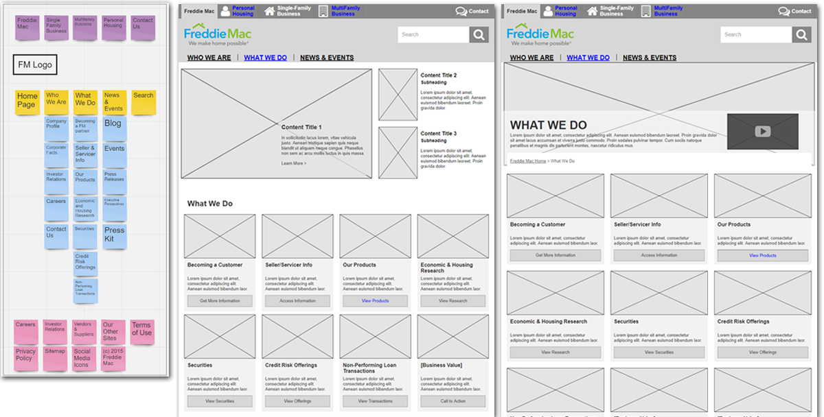
Two wireframes were created per each of the three original content architecture options. The wireframes were intended to supplement the diagrams and help tell our story of how the architectures could come to life. After the client selected their final two, which included mine, we built six additional desktop, one home page wireframe for each option plus two global header options.

Next Steps
After this discovery scope was completed, the client signed additional scopes of work to complete the architecture and design phases. Lastly, the development work was completed by their own development team.


